The Birch Tech brand
One mark, built three ways. The logo, the colours and the type that make Birch Tech recognisable across everything we do — with the source files to use them properly.

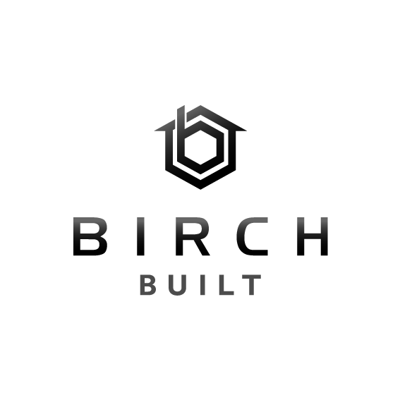
A mark with meaning
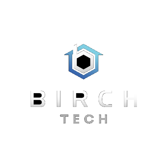
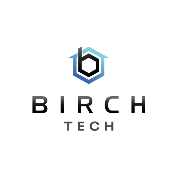
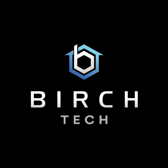
The icon fuses three ideas into one hexagon: a lowercase b for Birch, a roofline for the home and property we work on, and a hex for the engineering precision behind every install.
It's the constant across the whole family — only the colour and the word beneath it change.
Download icon
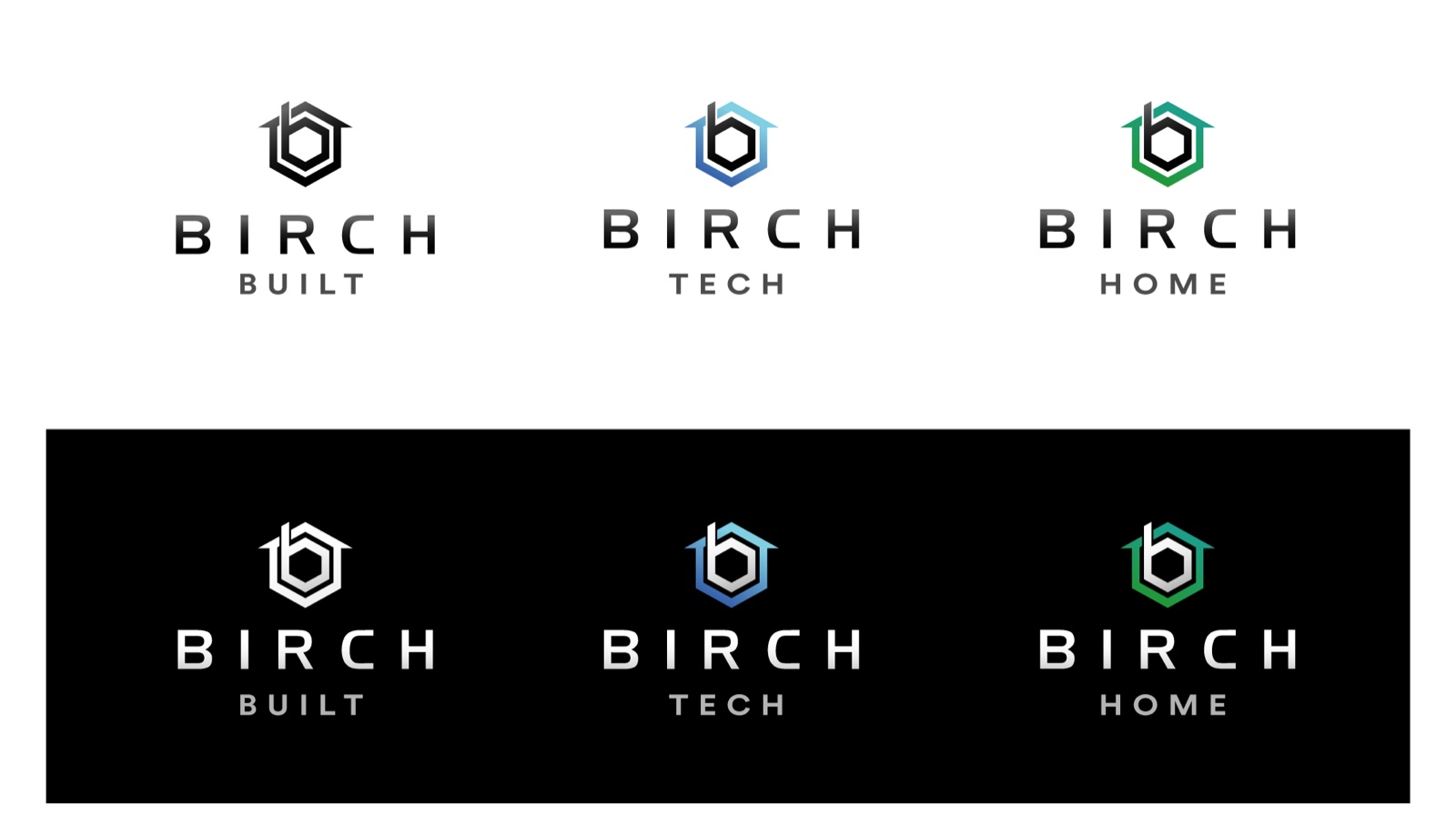
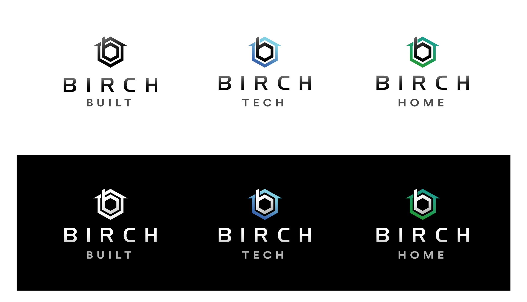
One icon, three arms
Birch is one brand with three specialisations. They share the mark and the type — the colour signals which arm you're dealing with.
Birch Built
Construction & building.
Birch Tech
Telecommunications, NBN, Starlink, data & AV.
Birch Home
Smart home & connected living.
Cool blues on carbon
The icon's blue gradient is the heart of the palette. Everything else is a deep, near-black carbon and a clean ink — high contrast, no clutter.
Logo gradient
Brand palette
Poppins, throughout
Poppins is the single typeface — geometric, friendly and clear at every size. The wordmark sets BIRCH in bold with wide tracking and the arm name below it, lighter and spaced.
The quick brown fox jumps over the lazy dog — 1234567890
Keep it clean
- Use the reversed logo on dark backgrounds, the primary on light.
- Keep clear space around the logo — at least the height of the icon.
- Let the mark breathe; give it room, never crowd it.
- Don't recolour the icon or wordmark, or swap the gradient.
- Don't stretch, rotate, add shadows or outline the logo.
- Don't place the logo on a busy background with low contrast.
Download the logo files
PNG for screen, EPS (vector) for print and large format. Please don't alter the artwork.
Questions about brand use? Email info@birchtech.com.au.